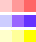
Color theory is a science in itself covering a large number of definitions, concepts and design applications. Understanding color theory will help you to generalise the working of color on Web pages. Color wheel helps in learning groupings of colors that are harmonious together and other colors that might clash.
While many designers feel at ease designing a site for many users, those same designers might feel inadequate when it comes to selecting colors and graphics. The strategic use of color can turn a good website into a great website. Designing your blog or homepage with an eye for color helps to set you apart from your competitors, and produces a cordial environment.
Color Wheel
Sir Isaac Newton’s circular diagram of colors formulated in 1666, based on red, yellow and blue, is traditional in the field of art. Since then scientists and artists have designed several versions of this concept. Conflicts about the validity of one format over another continue to provoke debate. In fact, any color wheel which exhibits a logically organized sequence of pure hues has merit.
Primary Colors
In traditional color theory, the primary colors comprise of red, yellow and blue. These are the 3 pigment colors that can not be formed by blending any other color. All other colors are derived by combinations of these 3 hues. In HTML, they are presented as:
- Red: #ff0000
- Yellow: #ffff00
- Blue: #0000ff
Whereas in CSS they can be recreated as:
- Red: #f00
- Yellow: #ff0
- Blue: #00f
Secondary Colors
Orange, green and purple are secondary colors formed by mixing the primary colors; red with yellow, yellow with blue and blue with red respectively. They are represented in HTML as:
- Orange: #ff9900
- Green: #00ff00
- Purple: #ff00ff
And in CSS as:
- Orange: #f90
- Green: #0f0
- Purple: #f0f
Tertiary Colors
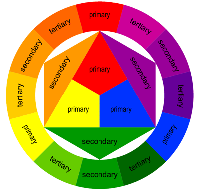 Yellow-orange, red-orange, red-purple, blue-purple, blue-green and yellow-green are tertiary colors formed by mixing a primary and a secondary color and they lie between the primary and secondary colors. They are represented in HTML as:
- Yellow-Orange: #ffcc00 or #fc0 in CSS
- Red-Orange: #ff6600 or #f60 in CSS
- Red-Purple: #cc00cc or #c0c in CSS
- Blue-Purple: #9900ff or #90f in CSS
- Blue-Green: #00cccc or #0cc in CSS
- Yellow-Green: #ccff00 or #cf0 in CSS
Colors, Tints, Shades, Value and Intensity
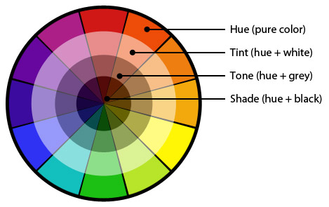 Colors or hues have historically been split up into primary, secondary and tertiary colors. Color wheel shows all the tints, tones and shades so you can begin to realize the color possibilities you have in sight. Tint is the lightness of a color. You can make color a lighter tint by adding the color white. If you add the color black to a color, you make it a darker shade. When you darken a color you change its shade. The lightness or darkness of a color is called a value. Intensity is the brightness or saturation of a color. A color is more intense when it is a pure color and not mixed with white or black. When you mix a color on the opposite side of the color wheel to your color you change its tone.
- Outermost band - tertiary color of red-orange (red + orange)
- Second band - the tint of that tertiary color (white added)
- Third band - the tone of the color (gray added)
- Innermost band - shade on the print wheel (black added)
Harmonious Color Combinations
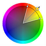
Harmonious color combinations use any two colors contrary to each other on the color wheel, any three colors evenly spaced around the color wheel forming a triangle or any four colors forming a rectangle. These combinations are called color schemes or color harmonies. Color schemes remain harmonious irrespective of the rotation of angle.
There are many theories for harmony. The following descriptions present some basic formulas.
Monochromatic Color Schemes
Monochromatic colors are all the hues, tints and shades of a single color. This scheme looks clean and elegant. Monochromatic colors go well together, producing a soothing effect. The monochromatic scheme is very easy on the eyes, especially with blue or green hues. While this scheme is the easiest to use, it doesn’t provide much excitement in a Web design for many designers.
Analogous Colors
Analogous colors sit next to each other on the color wheel. For example: blue, purple-blue, and purple; or red, red-orange, and orange. Play with the hues and saturation of analogous colors to create a harmonious color scheme.
Complementary Colors
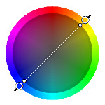
Complementary colors are opposite one another on the color wheel. By using colors that are opposite one another, including all the tints, tones and shades of both colors, you create color schemes that have intrinsically high contrast and so are brighter and more vivid. This scheme looks best when you place a warm color against a cool color. Some contrasting colors are red and green or blue and orange.
Split-Complementary Colors
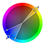
The split-complementary color scheme is a variation of the complementary color scheme. In addition to the base color, it uses the two colors bordering its complement. This provides high contrast without the strong tension of the complementary scheme. It is the popular color systems among artists because of its versatility. The split-complimentary color scheme is often a good choice for beginners, because it is difficult to mess up. In order to maximize results avoid using warm low saturation colors such as browns and dull yellows. The key is to use energetic, fairly aggressive split complementary colors. Gray them out if the result is too aggressive until you get the desired balance.
Triadic Color
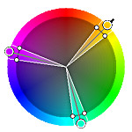
By setting an equiangular triangle on the color wheel, you can create lively color schemes. This scheme is popular among artists because it provides strong visual contrast while keeping harmony and color richness. The triadic scheme is not as contrasting as the complementary scheme, but it looks more balanced and harmonious. The triadic color scheme also carries warm and cool colors, but one temperature will override. The most basic color triad is the three primary colors red, yellow, and blue.
Tetradic Color Schemes
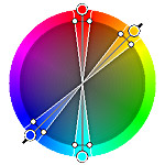
The tetradic scheme is the most diversified because it uses two complementary color pairs. The more colors you pick out, the more complex the color scheme. This scheme is hard to harmonize; if all four hues are used in same amounts, the scheme may look deranged, so you should select a color to be dominant or subdue the colors. However, one trick is to find a tint, tone or shade and adhere those regions instead of mixing pure colors and their tints, tones and shades.
Color Context
Its complex to see how color behaves in respect to other colors. Compare the contrast effects of various color backgrounds for the same yellow square.
Yellow appears brighter against a black background and somewhat dimmer against the white background. In contrast with blue-green, it displays brilliance. Observe that the yellow square seems bigger on black than on other background colors.
Get Ideas From the Pros
Consider popular websites that you visit often. They have set their website with a few strategic colors. This is an excellent marketing solution - customers remember that Microsoft is blue and white, Greenpeace is green.
Your website is unique, and your color scheme should reflect that. By opting a dominant color scheme for your blog or home page, readers will know, on every page, that they are viewing your website.
Color Tools
Many websites offer tools for picking out complementary colors. These resources help you to choose not only a main color to brand your website, but also accent or highlight colors that are both eye-catching and attractive. By searching for meanings of colors, you can find common words and feelings that people generally attach to various colors and hues.
Keep your Design Reader-Friendly
If you are inclined to paint your entire site in bright, sunny yellow, coral, and neon orange, be careful to maintain visibility high. Ward off bad color combinations by applying colors with similar values. If you are having problems mixing your two-to-four chosen colors, try shifting the value of one or two colors. Take additional care while using light text on dark backdrops. Try to keep the main content of your website heavy in distinctive contrast. Highlight the sample text with your mouse. If you can read it more easily when highlighted, switch the colors of the text and the background.
Warm vs. Cool Colors
Complementary color schemes contain both warm and cool colors. The use of these colors puts up contrast. If you notice how the colors work on the wheel, you’ll soon find out that you can’t choose one color without choosing its opposite. If you pick a hot red, the opposite is a cool green. In case of cool blue-green, you’ll finish up with a spicy red-orange on the other side.
1. Warm Colors
Warm colors would remind you of the summer, of autumn leaves, sunset and sunrise or fire and are normally invigorating, passionate, and positive. They consist of red, orange, and yellow, and variances of those three colors. Red and yellow are both primary colors, with orange dropping in the middle, which implies warm colors are all genuinely warm and aren’t created by blending a warm color with a cool color.
Red
Red is a very hot color affiliated with fire, violence, war, love, passion, anger, danger, warning and with importance. Red can actually have a physical effect on people, raising blood pressure and respiration rates and enhances human metabolism. In design, red can be a powerful accent color. It can be very versatile with brighter versions being more energetic and darker shades being more powerful and elegant.
Orange
Orange is a vibrant and energetic color associated with the earth, and with autumn in its dull forms and symbolizes change and movement in general. Being a name of a fruit, it can be associated with health and energy. In designs, orange compels attention. It’s often counted more friendly and tempting. It might be good for sites offering products on sale but is bad for those catering to the more sophisticated segment of web surfers.
Yellow
Yellow is considered the brightest and most energizing of the warm colors. It’s associated with happiness, sunshine, deception, cowardice, hope and with danger some times.
In your designs, shining yellow can add a sense of happiness and cheer. Softer yellows are usually used as a gender-neutral color for babies and young children. Dark yellows and gold-hued yellows can occasionally appear antique. It is best used as a highlight or to brighten-up a drab background. Attention is also required with using shades of yellow as they can appear dirty or sickly.
2. Cool Colors
Cool colors include green, blue, and purple, are often more muted than warm colors. Cool colors might remind you of nature, spring, ice or water. They are the colors of water and are generally soothing, relaxing, and somewhat reserved. Use cool colors in your designs to give a feel of calm or professionalism.
Green
Green represents new beginnings, growth, renewal and abundance. Alternatively, green can also stand for envy or jealousy and a lack of experience. Green can have a balancing and harmonizing effect in design and is very stable. It’s appropriate for designs related to wealth, stability, renewal, and nature. Brighter greens are more energizing and vivacious while olive greens are typical of the natural world. Dark greens are the most static and representative of affluence. The color is useful for marketing organic, healthy, natural, financial, and diet websites.
Blue
Blue is the only primary color inside the cool spectrum, which means the other colors are created by fusing blue with a warm color. Blue represents calmness, obligation, serenity, and has spiritual and religious connotations in numerous cultures. In design, light blues are refreshing, friendly, relaxed and tranquilizing, bright blues are energizing and invigorating whereas dark blues are excellent for corporate sites where strength and reliability are significant. It is well-suited to websites promoting technology, medical products, cleanliness, air, sky, water, and cars.
Purple
Purple is associated with royalty, creativity and imagination. Dark purples are customarily affiliated with wealth and royalty, while lighter purples are considered romantic.In design, dark purples can give a sense of wealth and luxury. Light purples are softer, associated with spring and romance. It’s best to use this color on sites dealing with women, children, and maternity.
3. Neutrals
Neutral colors are commonly combined with brighter accent colors and often function as the background in design. They can also be used on their own in design and can create very elegant layouts. The meanings and effects of neutral colors are much more affected by the colors surrounding them.
Black
Black is the strongest of the neutral colors. Positively, it’s associated with power, elegance, sophistication and formality. Negatively, it can be associated with evil, death, mystery and mourning. It is associated with revolt in some cultures.Black is commonly used in edgier and very elegant designs. It can be conservative or modern, traditional or unconventional depending on the colors it’s combined with. In design, black is commonly used for typography and other functional parts.
White
White often connected with purity, cleanliness, and virtue, goes well with any other color. White can suggest simplicity with high-tech products and safety and cleanliness with medical products. In design, white is generally considered a neutral background that lets other colors in a design have a larger voice. It is popular in moderate designs. White in designs can also depict either winter or summer, depending on the other design themes and surrounding colors.
Gray
Gray is conceived as moody, gloomy or a color of mourning. Gray is generally conservative and formal, but can also be modern and elegant. In some designs light grays can be used in place of white, and dark grays in place of black. It’s commonly used in corporate and professional designs. Pure grays are shades of black, while other grays may have blue or brown hues blended in.
Brown
Brown is warm neutral and a entirely natural color associated with the earth, wood, and stone. Brown can be associated with dependability and reliability, with steadfastness, and with earthiness. It can also be considered dull. In design, brown is usually used as a background color. It is also seen in wood textures and sometimes in stone textures.
Beige
Usually reserved for backgrounds, beige is somewhat unique as it can adopt cool or warm tones depending on the colors surrounding it. It has little effect in itself on the final impression a design gives when used with other colors. It has the warmth of brown and the coolness of white, and, is sometimes seen as dull and conservative. It symbolizes piety.
Cream and Ivory
Ivory and cream are sophisticated colors, with the warmth of brown and the coolness of white. They’re generally calm, and evokes a sense of history. In design, ivory can impart a sense of elegance and serene to a site. When combined with earthy colors like peach or brown, it can acquire an earthy tone. It can also be applied to lighten darker colors, without the blunt contrast of using white.
Although color combinations may appear complicated, every color schemes carry certain principles. These guidelines make it easy to understand which colors work unitedly to add interest and contrast to a Web site.
Color wheels and color tools make color-picking easy even for the unskilled designer. Once you resolve how to exhibit your business to your niche and what image you want them to associate with, your choice of color for your website becomes much easier. Use color to reinforce your company image and present consistency to your customers.
